What is a Gutenberg Block
Gutenberg Block in the context of WordPress
It is a reusable UI block (section), that we can reuse, duplicate, and usually style differently to suit our needs.
The days of the old Classic Editor have long passed, and we are now building websites in a component-based manner.
This helps us create different and unique page templates, no matter if we are editing a post, page, or an entirely new custom post type.
Theme Redone’s Gutenberg block, and how it is different
When we build software here at WebRedone, we always try to standardize and reuse our code, and components; Theme Redone’s Gutenberg Blocks are no exception.
Let’s take a look at a block from 2 points of view. One would be from the front-end & editor’s perspective, and the other one would be from the code’s perspective.
For the purposes of this quick introduction, we will be using a simple block that has only one field (component) for a title, later on, we’ll dive deeper and learn more about all the different components we have and that we can use to built blocks off of.
Editor / Front-End perspective
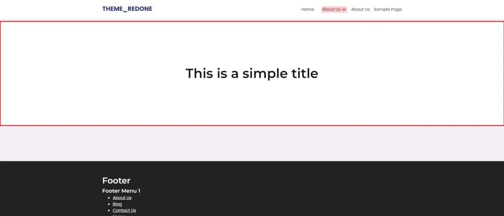
Front-End: From this perspective, the block is represented by a section, that we can reuse throughout our website.
Editor: In the context of an editor, the block changes based on its definition (code’s perspective), but, no matter what the definition is, it always has the same look, feel, and behavior.
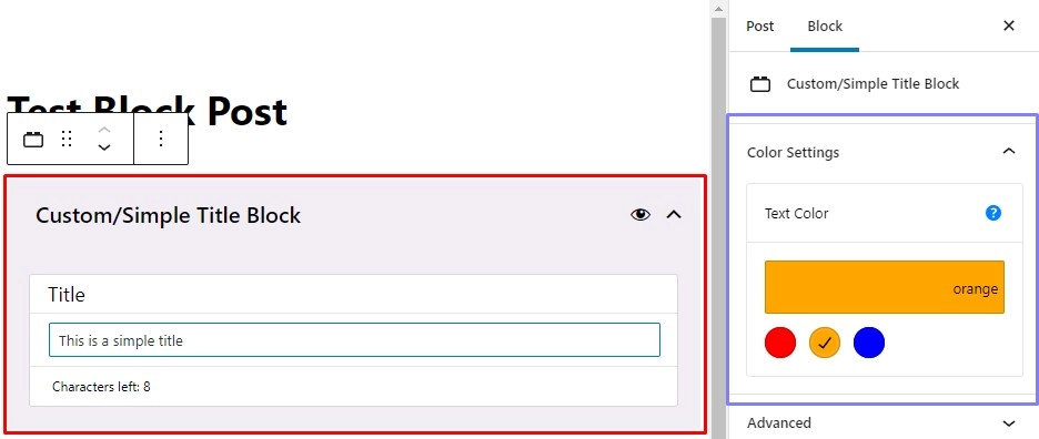
In the example image above, we have two highlighted areas.
The one on the left-hand side is the main area of the block and will be present for all the defined blocks. It will contain all the fields that we have defined. We use those fields to control the copy, images, and similar types of values that we will then render on the front-end; In summary, it contains the core controls for the elements that will be displayed on the front-end.
The area on the right-hand side is what we call an auxiliary area. It might contain all the additional controls for our block, such as color, padding, and margin settings. As its name says, this area is not always required. Some blocks might need it, some might not.
In the next articles, we will explain how to configure and enable/disable features of a block. For now, let’s focus on the general look and feel of the block, as seen in the editor.
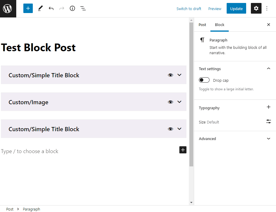
Core Main Area Behavior
Absolutely every block that we use will have 2 pieces of logic. As we can see from the image above, the main area contains 2 icons in the top part of it. The eye, and the chevron icons. Additionally, some blocks might contain a tooltip icon, in scenarios where we need to provide more information to the end-user.
- It will have a collapsed/uncollapsed state (to make it easier to focus on the block we are currently using).
The block can be collapsed/uncollapsed by clicking either on the chevron icon or anywhere on the top part besides the eye icon. - When we hover on the eye icon, the block (front-end) preview image will appear in the top-right corner of our editor.
Useful if we have a lot of blocks on the current page we are working with, and we want to quickly see what block we are working with (More times than not, we will forget the names of our blocks; Especially if we have a lot of them). This feature also exists when we are searching for a new block to add, we’ll get back to this further down in this article.
Adding a new block
If you’ve worked with Gutenberg blocks so far, you most probably already know how to insert a block.
- You can write / on the new line in the editor and start typing, and all the matching blocks will appear in the list
- Another way is by clicking the “plus” icon, and searching for the block from there, or by clicking the “plus” icon, and then the “Browse All” button.
Our addition to this process is that each of our blocks starts with “Custom/”, so it’s a bit easier to differentiate the blocks that we coded, from the core ones provided by WordPress. Another useful feature, that we mentioned above, is then even before we add a new block, in the process of searching for the one we need, if we hover the block from the list, a preview image will again appear in the top-right corner of the editor.
Here’s an example of this.

Block from a code’s perspective
Simply put, from a code’s perspective, Theme Redone’s Gutenberg Block is a set of a few files, each having its own purpose, that when used together, give us the editor and front-end logic and layout. Since there’s a bit more to write about all the files that comprise a block and their role, we will be explaining all that in the Block Structure article.