The key of the schema is what we will be using on the front-end to render the saved data.
Field Types
In this article, we will be using the terms “field” and “field type” interchangeably. We are referring to the same thing – the field that will be rendered inside the block on the edit screen. The only difference is that, when we say field type, we are referring to the structure of the field that will be rendered.
Field Types are controls (inputs) for various data types that appear in the editor as part of the Gutenberg block.
We use those fields to control the data that we will show on the front-end.
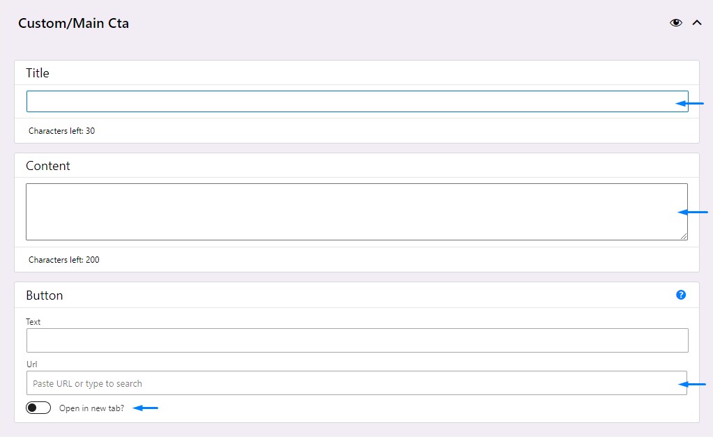
In the example image above, a block named “Main Cta”, is comprised of these three fields: Title, Content, and Button.
- The Title field is of type
"text"and we use it to handle short pieces of text. - The Content field is also of the type
"text", but is a variation that shows a textarea instead of an input. - The “Open in new tab?” field is of the type
"toggle"and returns a boolean that we can use for conditionals on the front-end.
Usually when we say field, we have one specific field. In the case of a Button, which is of "cta" field type, we are displaying three fields, that form one single control (field or field group). We design the cta field type specifically like this because we don’t want to repeat ourselves every time we need a field for the link that we will be displaying on the front-end.
How does a field get created?
Each field that appears in a block shown in the editor is a combination of two things: a React component and a Schema.
React Component
React code that is responsible for building a field is a pre-written piece of code that accepts various arguments based on which it renders a desired field in the editor.
In most cases, this will be automatic, and we won’t need to ever look at or refactor this code. What we should focus on is the Schema part of the field.
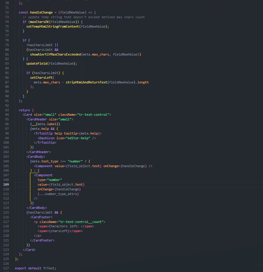
But, just as a sneak peek, and for the example purposes, here’s how the part of the TrText component (renders the Field of the type "text") will look like.
Schema
Field Schema is a snippet of code written in JSON format, that behind the scenes is used to pass arguments to appropriate components and build and render logic & UI for the desired field type.
This piece of code should be written in a model.json file of the corresponding block.
All of the available field types have corresponding schemas that are 90% the same, with a few variations.
Let’s take schemas for rendering a text field and a cta field as an example, and compare them.
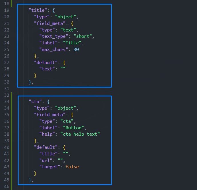
In the screenshot above we see two highlighted blocks of code; Those are the schemas that will be responsible for rendering two fields of types text and cta, in that order.
Right away, we can see that they are mostly the same (all of our fields are written with standardized schemas).
Each schema that we define will be at minimum be made up of these pieces:
- Key of the object. In this example, “title” and “cta”.
- “type”: “object” as the property of the object.
(All our schemas will have this property, as it takes a role in the automatic parsing logic that takes place behind the scenes). - “field_meta” key, and its value in the format of an object.
- “default” key, and its value in the format of an object.
Inside the field_meta property’s value object, we write the properties (some mandatory, some optional), that are used to identify and render a matching React component.
“type” property is mandatory, and in these two examples we see that we are using “text” and “cta”.
“label” property is also mandatory, and it is responsible for rendering the human-readable label for the field.
On the contrary, the “help” property defined in the cta field’s example is optional, and if present will be responsible for rendering the help text tooltip that appears when we hover on the “?” icon in the above example.
In the text schema example, right below the type, we see a “text_type”.
This can be either: "short", "long" or "rich".
For example, “short” renders a text input, and “long” renders a textarea.
“default” property is used to define the field’s default values and will differ based on the field type we are defining.
In the examples above, we see that for the field of type “text”, we only have one default property, which is "text".
On the other hand, for the cta example, we have three properties: "title", "url", and "target".
We also use these default property keys to render the field’s data on the front-end.
Here’s the example of rendering the title and cta fields’ data.
Rendering title field data
<h1>{$title['text']}</h1>Rendering cta field data
<a
  href="{$cta['url']}"
  {if $cta['target']}
    target="_blank"
  {/if}
>
  {$cta['title']}
</a>
or, a bit more concisely, via our tr_a() helper function:
{tr_a($cta)}For each of theme-redone’s field types, we’ve created separate articles where you can see how and where to use them, and how to define their schemas. We suggest you start with the Text Field Type.