View.js
As we’ve explained in the view.latte page (please read it before continuing), Gutenberg offers us two ways for rendering blocks. Via PHP and via JS. Our primary method and the preferred one is via PHP (latte). But, there are still use cases where we’d want to render it via JS. We would do that with this file.
Even if we are not using this file to render the block, but doing that via PHP, we still need to have this file. When rendering via PHP, this file (View.js), should have these two lines of code present.
[block-dir]/View.jsconst View = () => null;
export default View;
Rendering via JS
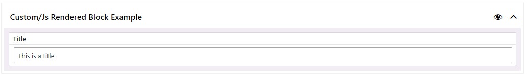
Let’s start with a simple example and with the model.json Schema definition. We will only have one text field, to begin with.
[block-dir]/model.json{
  "block_meta": {
    "BLOCK_REGISTER_NAME": "js-rendered-block-example",
    "BLOCK_TITLE": "Js Rendered Block Example",
    "keywords": ["test", "js"],
    "hasSidebar": false,
    "hasExample": true,
    "isJsRendered": true
  },
  "attributes": {
    "title": {
      "type": "object",
        "field_meta": {
          "type": "text",
          "label": "Title"
      },
        "default": {
        "text": ""
      }
    }
  }
}
The only difference in model.json file, when we want to render the block via JS is that now, inside the block_meta object we have defined the isJsRendered property, and set it to true. "isJsRendered": true. Everything else remains the same.
This is needed for rendering the block via JS.
The UI in the admin stays the same, and this is how it would look like for this particular example.
Using the View.js to render the data from this example block.
Let’s use JSON.stringify to see how the data is saved.
[block-dir]/View.jsconst View = (props) => {
  return (
    <section className="js-rendered-block">
      <pre>{JSON.stringify(props, null, 2)}</pre>
    </section>
  )
}
export default View
If we now inspect the front-end of the page where we used this block, this is what we would get.
[site]/page/block-output{
  "title": {
    "text": "This is a title"
  },
  "className": "wp-block-custom-js-rendered-block-example"
}
So, to show the title on the front-end, we would modify the View.js file’s JSX to look something like this.
[block-dir]/View.js
const View = (props) => {
  const title = props.title
  return (
    <section className="js-rendered-block">
      {title.text && <h1>{title.text}</h1>}
    </section>
  )
}

export default View
And, if we now inspect the source code on the front-end, we would get what we expect:
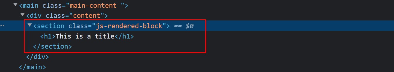
It works as expected, but there’s a quirk to this
The Quirk Explained
The quirk is related to the difference in how the block in the admin would behave. (as opposed to when we are using PHP to render it on the front-end).
Let’s say that instead of showing the title inside an h1 tag that lives in a section, we instead want to have this structure section>div>h2>[title].
Let’s do this and see what happens.
As you’ve noticed, once we refactor our JSX code and save, the front-end doesn’t immediately update. Our refactor didn’t affect it.
What we need to do is, go to the admin screen. Once we go there and refresh the page, we see something strange. The block temporarily breaks and we see a “The block contains unexpected or invalid content.” warning message.
This always happens when we refactor JSX (HTML) (and it’s not a theme-redone’s bug, it’s just how Gutenberg blocks natively work, there are a lot of explanations about this all over the internet), and, we all know that in real-life scenarios when we are developing websites, we are always doing this; We realize that we might have structured the HTML better, or the client has feedback and wants to change something, etc…
The thing is, that we have that “Attempt Block Recovery” button, that will fix everything; most of the time. Sometimes the block might completely break, and you would need to remove it from the content in admin, then re-add it, and re-populate it. This is not a problem during the development phase. But, let’s say we’ve finished the website and it went live. The website has about 20 pages, and this block is used multiple times on most of those pages. The client at that point requests a change, and we refactor the code and push it to live.
He/she would then need to go to each page where the block is used and try to do the recovery fix, or if that doesn’t work out, recreate the block from scratch.
For this simple example block containing only a title, this is not such a problem, but again, we can avoid that by using PHP rendered blocks, where refactoring how the block is presented on the front-end doesn’t cause this, and this is one of the reasons why we prefer the PHP way.
We also prefer the PHP way because of quite a few helper functions that can make our life easier and help us develop faster.
With all this said, we don’t suggest not using the JS rendering approach, but be aware of this behavior and approach it with caution.
It still has some really good use cases where we specifically need to use the JS approach. We’ll explain those further down on this page.
Let’s compare the PHP and JS rendering a bit more
Our example block is a bit simple; We only have one simple text field.
Let’s add more different fields and compare the two approaches.
[block-dir]/model.json{
  "block_meta": {
    "BLOCK_REGISTER_NAME": "js-rendered-block-example",
    "BLOCK_TITLE": "Js Rendered Block Example",
    "keywords": ["test", "js"],
    "hasSidebar": false,
    "hasExample": true,
    "isJsRendered": true,
    "grid": "2"
  },
  "attributes": {
    "title": {
      "type": "object",
      "field_meta": {
        "type": "text",
        "label": "Title",
        "variation": "rich",
        "col": "1"
      },
      "default": {
        "text": ""
      }
    },
    "subtitle": {
      "type": "object",
      "field_meta": {
        "type": "text",
        "label": "Subtitle",
        "col": "1"
      },
      "default": {
        "text": ""
      }
    },
    "text": {
      "type": "object",
      "field_meta": {
        "type": "freeform",
        "label": "Text",
        "col": "1"
      },
      "default": {
        "text": ""
      }
    },
    "cta": {
      "type": "object",
      "field_meta": {
        "type": "cta",
        "label": "Button",
        "col": "1"
      },
      "default": {
        "title": "",
        "url": "",
        "target": false
      }
    },
    "image": {
      "type": "object",
      "field_meta": {
        "type": "image",
        "label": "Image",
        "col": "2"
      },
      "default": {
        "src": "",
        "id": null
      }
    },
    "list": {
      "type": "array",
      "field_meta": {
        "type": "repeater",
        "label": "List",
        "max_rep": 4,
        "col": "after",
        "subfields": {
          "list_item": {
            "type": "object",
            "field_meta": {
              "type": "text",
              "variation": "rich",
              "label": "List Item"
            },
            "default": {
              "text": ""
            }
          }
        }
      },
      "default": []
    }
  }
}
This Schema will generate these fields in the admin
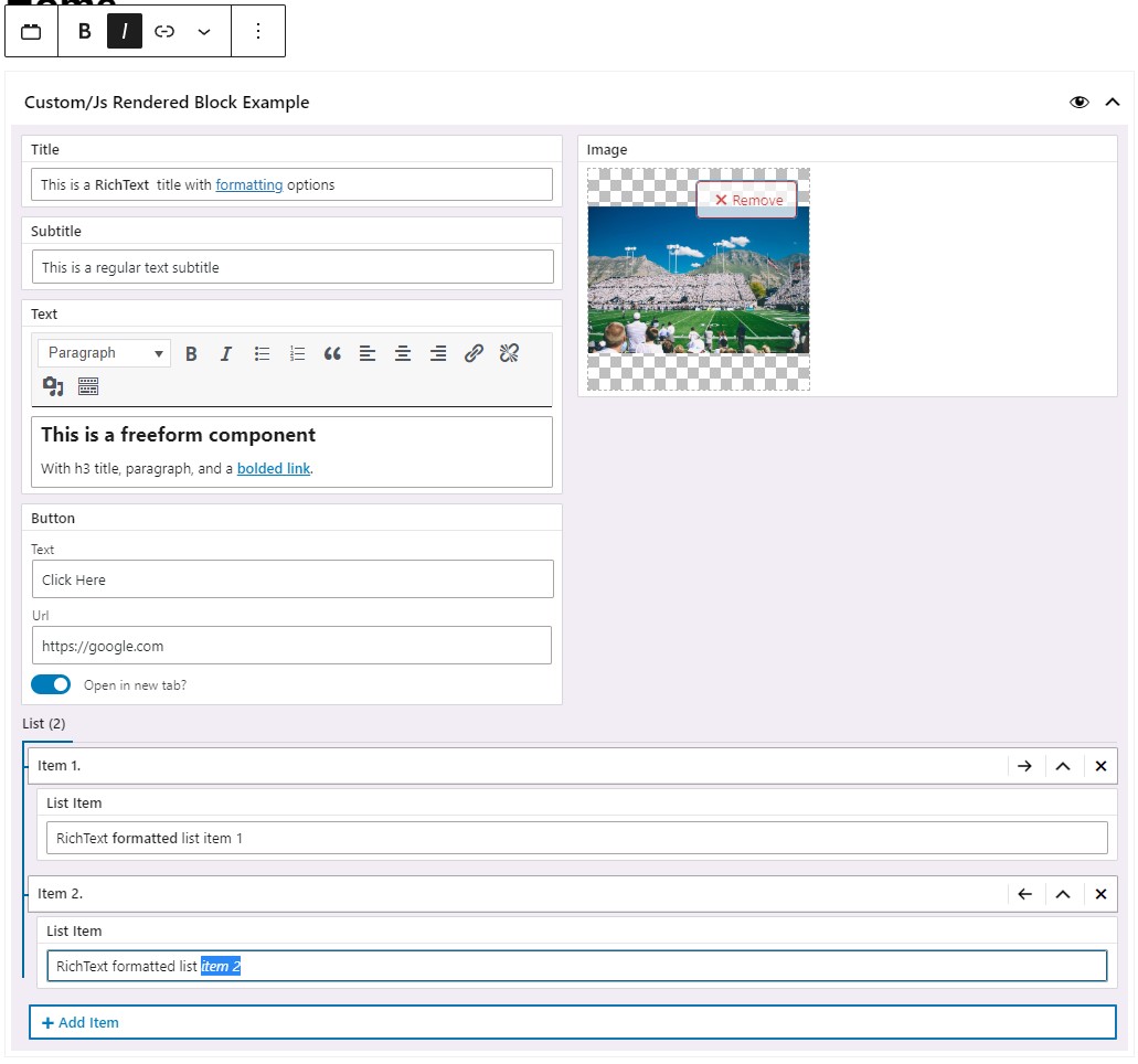
In summary, we added and populated these Field Types:
- The Title field is now a RichText component
- Subtitle – regular text input field
- Text – Freeform component
- Button (cta) – CTA component
- Image – Image component
- List – Repeater component with each List Item being a RichText component
Rendering via JS (JSX)
[block-dir]/View.jsconst View = (props) => {
  const title = props.title
  const subtitle = props.subtitle
  const text = props.text
  const cta = props.cta
  const image = props.image
  const list = props.list

  let cta_attributes = {}
  if (cta.target) {
    cta_attributes = {
      target: '_blank',
      rel: 'noopener noreferrer',
    }
  }

  return (
    <section className="js-rendered-block">
      <div className="container">
        {title.text && <h1 dangerouslySetInnerHTML={{ __html: title.text }} />}

        {subtitle.text && <h2>{subtitle.text}</h2>}

        {text.text && <div dangerouslySetInnerHTML={{ __html: text.text }} />}

        {cta.url && cta.title && (
          <a href={cta.url} className="btn btn--brand" {...cta_attributes}>
            {cta.title}
          </a>
        )}

        {image.src && (
          <img src={image.src} alt="We would need to write it on our own" />
        )}

        {list.length && (
          <ul>
            {list.map((obj, index) => {
              if (!obj.list_item.text) return null

              return (
                <li
                  key={index}
                  dangerouslySetInnerHTML={{ __html: obj.list_item.text }}
                />
              )
            })}
          </ul>
        )}
      </div>
    </section>
  )
}

export default View
Note that with each JSX update, we caused the block to break in the editor (as explained above), and after each JSX update, we needed to go to admin, click that “Attempt Recovery” button, and then refresh the page.
Sometimes that alone didn’t work, and we needed to recreate the block. To finish writing the JSX and make sure nothing broke, we needed about 10 minutes because of its quirks.
Rendering via PHP (latte)
[block-dir]/view.latte<section class="js-rendered-block">
  <div class="container">
    <h1 n:ifcontent>{$title['text']|noescape}</h1>

    <h2 n:ifcontent>{$subtitle['text']}</h2>

    <div n:if="!empty($text['text'])">
      {$text['text']|noescape}
    </div>

    {tr_a($cta, "btn btn--brand")}

    {if $image['src']}
      {tr_get_media($image, true)}
    {/if}

    <ul n:if="!empty($list)">
      <li n:foreach="$list as $item" n:ifcontent>
        {$item['list_item']['text']|noescape}
      </li>
    </ul>
  </div>
</section>
When we compare latte to JSX, we see how much cleaner and shorted the code is.
The block inside the admin never broke while we were refactoring the latte file.
Looping is so much easier and concise, plus, we have the benefit of using some of our helper functions (tr_a() and tr_get_media()) that do the “heavy-lifting” for us. Additionally, with the tr_get_media() function, we have that second boolean attribute (when present and set to true, it will make the image load asynchronously). And in the end, as opposed to JSX, where we needed about 10 minutes to finish writing the rendering logic, with latte, we did that in 2 – 3 minutes only.
To summarize the comparison. We would suggest you use the PHP (latte) rendering approach most of the time to avoid headaches. And use the JS (JSX) approach for specific scenarios that are described below.
When to consider rendering via JS (JSX)
We’ll show you 2 examples where rendering the block via JSX can be extremely useful.
Example 1: The Wrapper Block
Let’s imagine that we want the possibility of having a wrapper block.
A block that doesn’t render anything on its own, but actually renders blocks that are nested within it.
Additionally, this wrapper block will have a Select Field where we can determine the background color of the section (block) that will wrap around the nested blocks.
For the brevity of this example, we will have only 2 blocks:
- simple-title-block – this will be a simple block that only renders a title inside a div.
- example-wrapper-block – this will be our wrapper block that wraps two simple-title-blocks
This will be the code responsible for creating the simple-title-block.
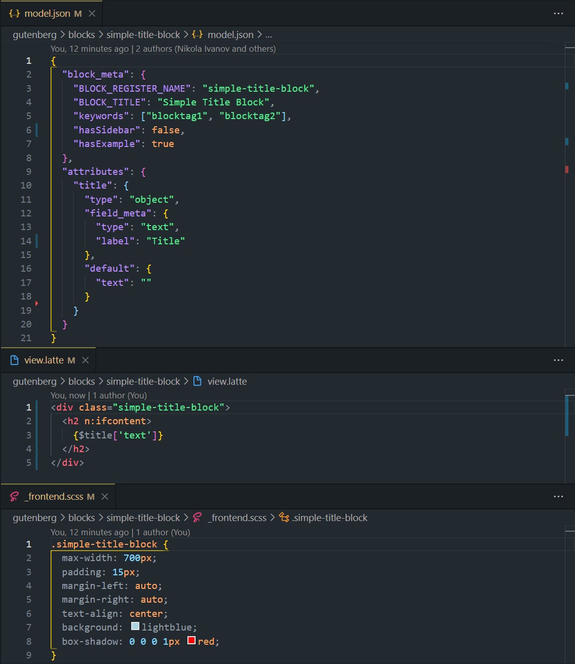
This block’s logic should be self-explanatory based on the screenshot. It’s just a simple block with one Text Field, that renders the div>h2>[title] on the front-end.
Let’s focus on the example-wrapper-block
[example-wrapper-block]/model.json{
  "block_meta": {
    "BLOCK_REGISTER_NAME": "example-wrapper-block",
    "BLOCK_TITLE": "Example Wrapper Block",
    "keywords": ["wrap", "background"],
    "hasSidebar": false,
    "hasExample": true,
    "isJsRendered": true
  },
  "attributes": {
    "wrapper_bg_color": {
      "type": "object",
      "field_meta": {
        "type": "select",
        "options": [
          { "label": "White", "value": "--c-white" },
          { "label": "Silver", "value": "--c-silver" }
        ],
        "label": "Background Color"
      },
      "default": {
        "value": "--c-white"
      }
    }
  }
}
Two things to note about the Schema above are that the "isJsRendered": true is present, and we have a Field Schema for the Select Field Type (with 2 options: white and silver. White is the option selected by default) that we will use in the admin.
[example-wrapper-block]/_frontend.scss.example-wrapper-block {
  --c-white: #fff;
  --c-silver: #cecece;
  padding-top: 200px;
  padding-bottom: 200px;
}
In this file, we are just defining the 2 CSS variables that will be set via the Select Field in the admin and used on the front-end.
[example-wrapper-block]/EditMain.jsconst { InnerBlocks } = wp.blockEditor
import TrDefaultFieldsHandler from '../../components/block-elements/TrDefaultFieldsHandler'

const EditMain = (props) => {
  const { className } = props

  return (
    <div className={`${className}`}>
      <TrDefaultFieldsHandler data={{ ...props }} />
      <InnerBlocks onClick={(e) => e.stopPropagation()} />
    </div>
  )
}

export default EditMain
Please read the EditMain.js page, if you haven’t already, before continuing.
In the EditMain.js file of the example-wrapper-block we have two important lines of code:
- Line 9: TrDefaultFieldsHandler component, explained in the EditMain.js page. It handles the Select Field in this example
- Like 10: InnerBlocks – This is Gutenberg’s component that makes it possible to nest blocks into another block.
[example-wrapper-block]/View.jsconst { InnerBlocks } = wp.blockEditor

const View = ({ wrapper_bg_color }) => {
  return (
    <section
      className="example-wrapper-block"
      style={{ backgroundColor: `var(${wrapper_bg_color.value})` }}
    >
      <InnerBlocks.Content />
    </section>
  )
}

export default View
And finally, in the View.js file we are rendering everything on the front-end.
We are destructuring the wrapper_bg_color from props and passing its value as a CSS variable to the style attribute of the wrapper section.
Right below that line, on line 9, we are again using Gutenberg’s InnerBlocks component, but now like this <InnerBlocks.Content />. This is responsible for outputting the nested blocks inside our wrapper block.
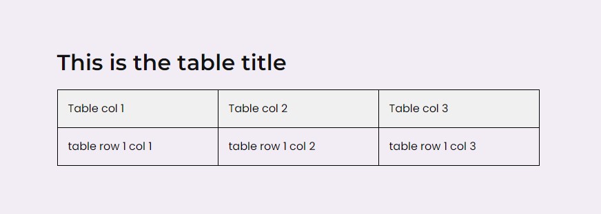
This is the result

This was a simple example. You can imagine adding more controls.
For example, padding-top and padding-bottom controls. Then, maybe if you want to have two sections, and then in between them some SVG graphic, what you could do is create horizontal and vertical position sliders by which you could position the graphic, and so on.
In the end, this is just regular React code (enhanced by WP stuff), and almost anything is possible.
Example 2. Using Gutenberg’s core/table (or any other) block inside InnerBlocks and adding additional fields
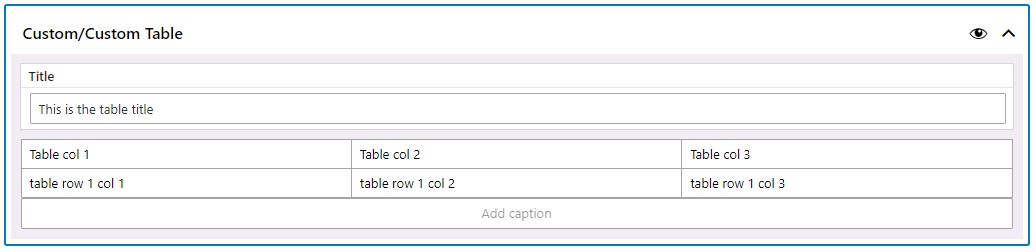
Let’s say we want to use Gutenberg’s core/table block, but also add our title field that will be shown above the table on the front-end.
To achieve this, this is everything we need.
[custom-table]/model.json{
  "block_meta": {
    "BLOCK_REGISTER_NAME": "custom-table",
    "BLOCK_TITLE": "Custom Table",
    "keywords": [
      "table",
      "custom"
    ],
    "hasSidebar": false,
    "hasExample": true,
    "isJsRendered": true
  },
  "attributes": {
    "title": {
      "type": "object",
      "field_meta": {
        "type": "text",
        "label": "Title"
      },
      "default": {
        "text": ""
      }
    },
  }
}
[custom-table]/EditMain.jsconst { InnerBlocks } = wp.blockEditor
import TrDefaultFieldsHandler from '../../components/block-elements/TrDefaultFieldsHandler'
const BLOCKS_TEMPLATE = [['core/table', {}]]

const EditMain = (props) => {
  const { className } = props

  return (
    <div className={`${className}`}>
      <TrDefaultFieldsHandler data={{ ...props }} />
      <InnerBlocks template={BLOCKS_TEMPLATE} templateLock={true} />
    </div>
  )
}

export default EditMain
Here, we are locking the InnerBlocks to only use one table block. We won’t be able to remove it or add any other blocks.
[custom-table]/View.jsconst { InnerBlocks } = wp.blockEditor

const View = ({ title }) => {
  return (
    <section className="custom-table">
      {title.text && <h2>{title.text}</h2>}
      <InnerBlocks.Content />
    </section>
  )
}

export default View
In the admin, this block would look like this
And this is how it might look like on the front-end