model.json file
Model.json is the most important and required file for creating blocks in the theme-redone framework. It is a JSON file that we use to write the Schema for the block we are working with.
By Schema, we basically mean a configuration, that the framework will use to build the block and its fields.
As said above, it is a JSON file, but we can look at it like a regular object with two main properties that are also represented as objects.
Those two properties (objects) are:
block_meta
We use the block_meta object to define how the block, or more specifically its header part would look like, and the core logic for each block.
This part of the schema would usually look like this:
{
  "block_meta": {
    "BLOCK_REGISTER_NAME": "image",
    "BLOCK_TITLE": "Image",
    "keywords": ["image", "photo", "figure"],
    "hasSidebar": false,
    "hasExample": true
  },
  "attributes": {...}
}
Properties that exist as part of this object are:
- BLOCK_REGISTER_NAME (required)
- BLOCK_TITLE (required)
- keywords (required)
- hasSidebar (required but can be passed false)
- hasExample (optional)
- help (optional)
- grid (optional)
- isJsRendered (optional)
BLOCK_REGISTER_NAME
Required property. Needs to have the same kebab-case name as the folder of the block.
Example: If the block’s folder name is “home-hero”, the value of this property should be the same:
"BLOCK_REGISTER_NAME": "home-hero"
BLOCK_TITLE
Required property. Used to define the human-readable name of the block that will appear in the header of the block, and also when searching for/trying to insert this block.
Continuing with the example above, we could write it like this:
"BLOCK_TITLE": "Home Hero"
keywords
Used to define keywords that will make it easier for us to search for the block. Accepts string array as value.
Based on the example above, this could look something like this:
"keywords": ["hero", "home", "headline"]
hasSidebar
Optional property. If present and if it has a value of true, we would need to create an EditSidebar.js file, which we would use to render fields in the auxiliary sidebar on the right-hand side of the main Gutenberg editor. For now, let’s just remember that should we want to use the sidebar fields, we need this property present and set to true. For the explanation of this file, read the EditSidebar.js page.
"hasSidebar": true
hasExample
This property is optional, but if present and set to true, we would need to create a screenshot of the block and save it inside the same directory of the block we are working with by the name of “example.jpg”.
If we do this, our block’s header will get the eye icon, that, when hovered will display an image screenshot of how this block would look on the front-end in the top-right part of the screen.
It will also show this image when we hover on this block’s name while we are searching for it in the inserter. It helps with navigation. Especially if we have a lot of blocks.
"hasExample": true
help
Optional property. If used, its value should be a string. It will be used to add a “?” icon in the header part of the block, that, when hovered, will show a popup with helper text.
Here’s the example of this, applied to the same block we used as an example so far.
"help": "This block should be used only on the homepage, and only as the first block."
grid
Optional property. If used, it expects its value to be either one of these three strings: “2“, “2-1“, “1-2“.
By default, each field in the block will be rendered beneath the previous one. This property could change that, and we could use it to “group” fields and show them in the desired column of the grid that will be created if we use a combination of the grid property defined and set to true, and also a col field, defined and set to each field. (We will explain this further a bit later in this article in the attributes chapters).
Each of the three variations (“2”, “2-1”, “1-2”), will create a different grid.
- “2” – two equally wide columns (50%, 50%)
- “2-1” – two columns, where the first one is twice as wide as the second one.
- “1-2” – two columns, where the second one is twice as wide as the first one
"grid": "2"
Here’s a quick example:
{
  "block_meta": {
    "BLOCK_REGISTER_NAME": "block-cols-example",
    "BLOCK_TITLE": "Block Cols Example",
    "keywords": ["cols", "example"],
    "hasSidebar": false,
    "hasExample": true,
    "grid": "2"
  },
  "attributes": {
    "title_start": {
      "type": "object",
      "field_meta": {
        "type": "text",
        "label": "Title Start"
      },
      "default": {
        "text": ""
      }
    },
    "title_left": {
      "type": "object",
      "field_meta": {
        "type": "text",
        "label": "Title Left",
        "col": "1"
      },
      "default": {
        "text": ""
      }
    },
    "title_right": {
      "type": "object",
      "field_meta": {
        "type": "text",
        "label": "Title Right",
        "col": "2"
      },
      "default": {
        "text": ""
      }
    },
    "title_end": {
      "type": "object",
      "field_meta": {
        "type": "text",
        "label": "Title End",
        "col": "after"
      },
      "default": {
        "text": ""
      }
    }
  }
}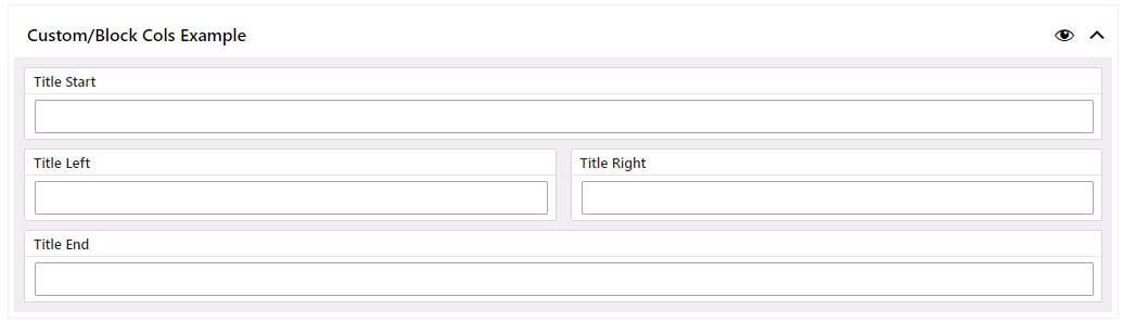
Notice how the fields are laid out, based on the Schema defined above. Fields that have the “col” property and a value of “1” or “2” will be placed in the matching columns. Fields without the col property will be placed before everything, and the ones with the “col” property that has the value of “after” will be placed after everything.
isJsRendered
Gutenberg allows us to write the front-end code either in PHP (in theme-redone, that would be latte templates), or in JSX. We opted for the PHP (latte) as the default. This can be overwritten via this property.
Should we want to render the field via JSX as opposed to latte (one of the reasons for this might be if we want to create a wrapper (template) block in which we can pass other blocks via the InnerBlocks property). Should we want to do this, we would add this property and set it to true.
"isJsRendered": true
Read more about this feature on the View.js page.
attributes
So far, we’ve talked about the global block configuration (block_meta section).
On the other hand, the attributes property (whose value is also an object), is what we use to define the fields (Field Types) we will be using in the block, either in the main or the auxiliary sidebar area.
Let’s start with a simple example that we’ll refactor later to show all the possibilities.
{
  "block_meta": {...},
  "attributes": {
    "title": {
      "type": "object",
      "field_meta": {
        "type": "text",
        "label": "Main Title"
      },
      "default" : {
        "text": ""
      }
    }
  }
}
This will define the schema for a Text Field Type by the name of “title”. It will render the TextControl component inside the block for editing the data that will be shown on the front end.
Before continuing, we suggest reading at least the Text Field Type page, to better understand this, and then come back and continue.
All of the fields (except for the fields whose names start with “inspector”; these fields would be rendered via the EditSidebar.js file, and we will explain how to write schemas for those fields on the EditSidebar page) that we define inside the attributes object, will be rendered in the editor’s main block area. EditMain.js file would be responsible for creating and rendering the fields based on the schema that we define here. Read more on the page dedicated to the EditMain.js file.
If we want to add a schema for another field, we would simply write it below the title schema that we defined above. Let’s add the subtitle schema in the next example.
{
  "block_meta": {...},
    "attributes": {
      "title": {
      "type": "object",
      "field_meta": {
        "type": "text",
        "label": "Main Title"
      },
      "default" : {
        "text”: ""
      }
    },
    "subtitle": {
      "type": "object",
      "field_meta": {
        "type": "text",
        "label": "Subtitle",
        "help": "Optional subtitle, that, if populated, would be rendered below the title"
      },
      "default" : {
        "text": ""
      }
    }
  }
}
We have now defined two fields, title, and subtitle (each field’s key – or field name, is of course up to you, we could have also named them headline & headline_two).
If we take a look at line 19, we see that the second field (subtitle), has the “help” property. This is an optional property that could be used for all the fields defined inside model.json. It would render a “?” icon next to the title of the field in the editor, and when hovered, will display a tooltip with help text.
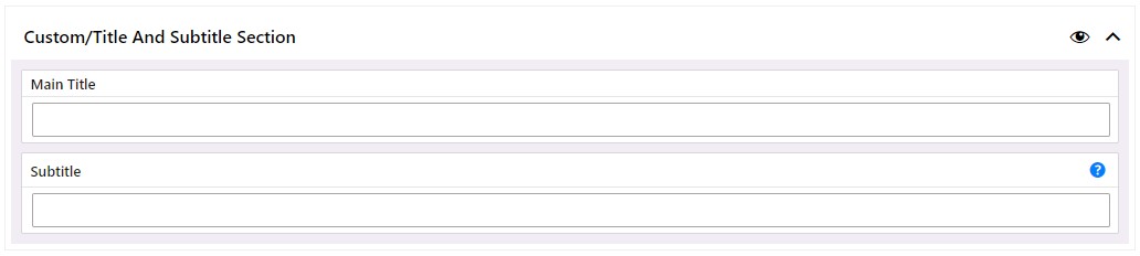
The complete model.json schema for these two fields would look like this.
{
  "block_meta": {
    "BLOCK_REGISTER_NAME": "title-and-subtitle",
    "BLOCK_TITLE": "Title and Subtitle Section",
    "keywords": ["title", "subtitle", "section"],
    "hasExample": true
  },
  "attributes": {
    "title": {
      "type": "object",
      "field_meta": {
        "type": "text",
        "label": "Main Title"
      },
      "default" : {
        "text": ""
      }
    },
    "subtitle": {
      "type": "object",
      "field_meta": {
        "type": "text",
        "label": "Subtitle",
        "help": "Optional subtitle that, if populated, would be rendered below the title"
      },
      "default" : {
        "text": ""
      }
    }
  }
}
In the editor, the block would look like this.
As we can see, the fields are stacked each beneath the previous one, but a bit above in this article we’ve written about the grid property that can be used inside the block_meta object, and we’ve mentioned that each field would need to have the “col” property defined inside field_meta. (In fact, not all the fields need the col property, the ones where we don’t define it, will just be stacked as in the example above. The other ones, that have the col property defined inside its field_meta can have either of these string values: “1”, “2”, “after”.
A short explanation of the fields starting with the “inspector_” prefix
As mentioned above, these fields would not appear inside the main area of the block, as with this prefix, we are marking them to be rendered in the auxiliary sidebar area, via the EditSidebar.js file.
While this is the case, we still write them with the same syntax we saw above (you can read more about each of the available Field Types on their dedicated pages).
We suggest you start with the Field Types page.
{
  ...,
  "inspector_bg_color": {
    "type": "object",
    "field_meta": {
      "type": "select",
      "options": [
        { "label": "White", "value": "white-variation" },
        { "label": "Silver", "value": "silver-variation" }
      ],
      "label": "Section Background Color"
    },
    "default": {
      "value": "white-variation"
    }
  },
  ...
}