ABOUT NULIFE
NuLife Recovery is a luxury co-ed inpatient and outpatient residential treatment center based in the beautiful hills of Calabasas, California adjacent to Malibu; the tranquil 14 acres provide patients a chance to find peace.
“The truth is, addiction is not a moral failing. A lack of willpower or weakness does not cause it. It is an illness – that affects the mind, takes over the body, and sickens the spirit – and it is treatable. However, not all treatment is the same. Contrary to popular belief, getting sober for the sake of being sober, isn’t enough. Long-term recovery requires much more than abstinence.”
REQUIREMENTS
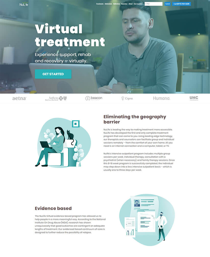
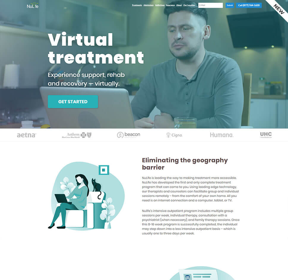
Nulife approached us with a desire to redesign their landing page, and give it a more professional and up to date look.
That was only one aspect of the project, as they also needed an implementation of a new booking form that would automate their process and gather information in one place about Initial assessment date, contact information and Insurance & Payment information of a prospect.
They had some rough guidelines about how the new page layout would look like, what kind of logic and animations they wanted.
This was a beginning project as we are currently in the process of completely redesigning and transferring their static website to WordPress for easier management and better SEO and Load Time Optimization.
HOW WE DID IT
Since this was a single landing page on their website consisting of more than 30 other pages, we decided that we should keep the existing header and footer (for now, in the whole website redesign project that will be redesigned as well to fit better).
Nulife had an idea to use a video as a background of the hero area which we optimized and implemented.
After thinking and researching about what booking system we should use to make their process more intuitive and faster, we tried a few options and in the end we opted for a paid service called youcanbook.me, which perfectly fulfilled all the needs for the form and their admin user interface is pretty straightforward in terms of setting the fields, available dates, and managing prospects and follow-up emails.
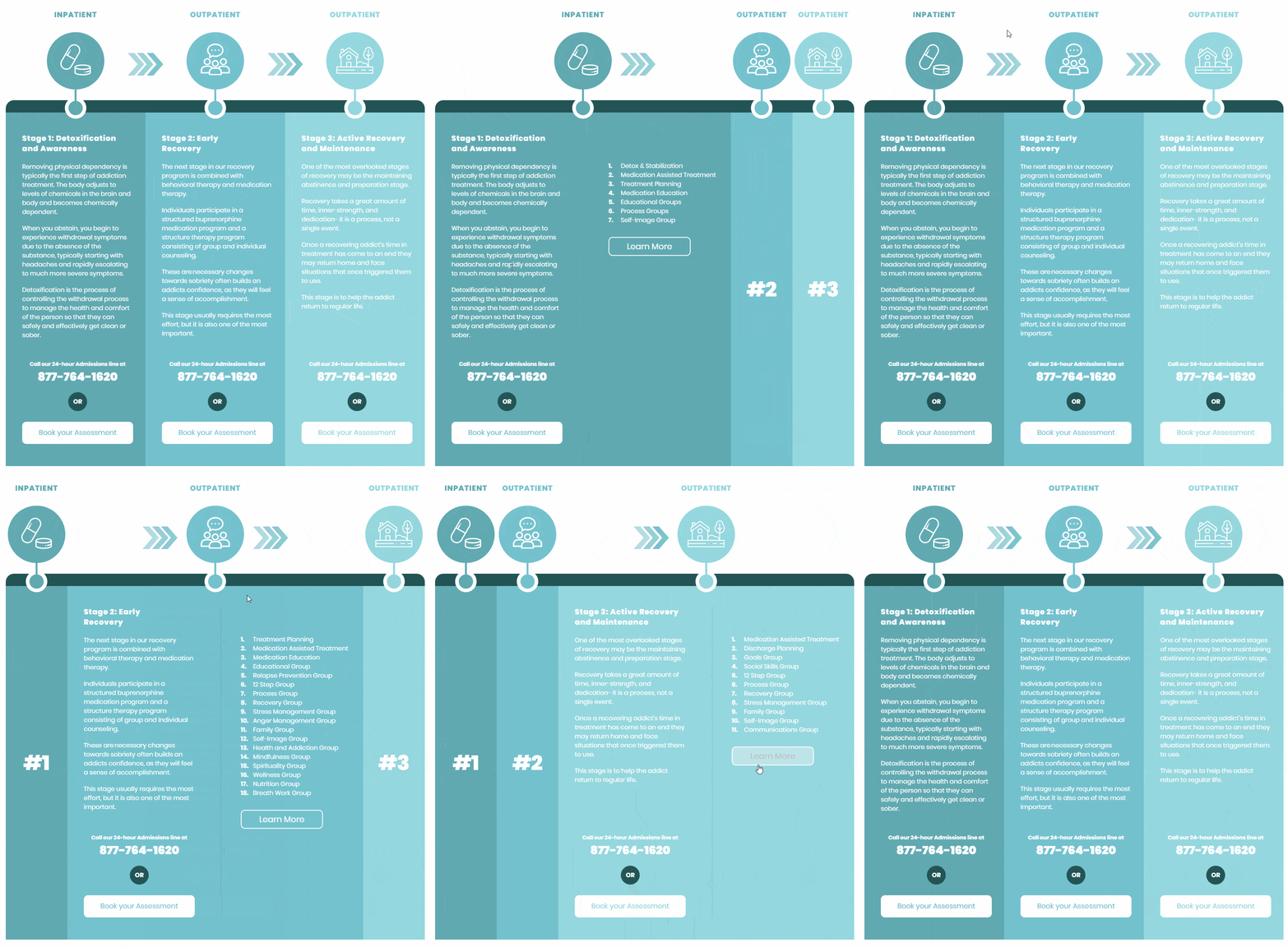
The overall design is based on their current color scheme with a few variations and a bit more white space for the better placement of sections and improved readability.
We also designed SVG illustrations to accompany related text content, and subtly animated them to make them feel a bit more “alive”.
Tech: Javascript(es6), HTML, SASS, Bootstrap
More Projects
Peemz
Peemz is a French company that allows boutiques and designers to connect to the world through the mobile experience.
View ProjectZakuvavanje
Zakuvavanje is a fine-dining food blog run by two professional chefs and a web developer with a great passion for cooking.
View Project