A developer’s guide to web design
This web design guide is an opinionated one, as it is from a developer’s perspective, and focuses more on the technical aspect of designing for the web more than on the creative one.
Learning how to design for web if you are just starting might seem difficult and confusing, but you need to start from somewhere and take baby steps. This website design guide will serve you as a solid starting point to continue further develop your skills.
It aims to teach designers how to design for developers, and to help graphic designers transition to web design. Also, these website design guidelines are recommended by google and follow the latest web design standards and best practices.
You will learn about terminology used in web design, web design conventions, web design principles, what is a style guide and a handful of useful tools that will help you in your journey of designing for the web.
Disclaimer: This website design guide assumes you have some knowledge of Photoshop. In case you don’t, there are still some useful tips for you that you can implement in other tools.

HOW TO LEARN WEB DESIGN?
As with everything else in life, nothing comes easy and fast when you start learning web design.
Fortunately, there are a lot of for-free resources out there. Just do a quick google search for “how to learn website design?”. You will be surprised how much free content about it is out there.
This web design guide will teach you a lot, but you will need to continue expanding that knowledge. That said, reading alone is not enough.
What makes you really understand things in-depth and excel is a lot of practice and learning from the best.
A few ideas are searching websites like Behance, Dribble. Or in general, finding a great looking website and trying to design something similar. You will need to “steal” a bit in the beginning, of course.
There are sites like Udemy which have a lot of great tutorial for a bargain.
Again, whichever road you take, it all boils down to a lot of practice.
WHAT IS A STYLE GUIDE AND HOW DO YOU CREATE ONE FOR YOUR WEB DESIGN PROJECT
Web design style guide or a brand style guide as it is also known is a set of rules that you as a designer define and then use in the design process of a website. It is the set of rules that will determine how your brand will be portrayed.
It is comprised of rules about fonts that will be used, what font-sizes and weights they will use, what color palette you will use to create a website for a particular brand. The style guide may also have guidelines about UI elements that are repeating throughout a website, think buttons and icons for example.
The benefits of having one and using it as a starting point are that you, the designer, will maintain a consistent style in your designs, and consistency is a key to a brand’s success. If after you finish and leave the project some other web designer takes on, or you work as part of a team, it makes sure everyone will follow the same already defined rules.
It makes the job easier for a developer as well. Before starting to develop the website, the developer can take a look at a style guide and start defining the rules. Rules about the typography, buttons and other UI elements that he will later use to compose a website. This stops wasting caused by manually measuring things in a Photoshop file.
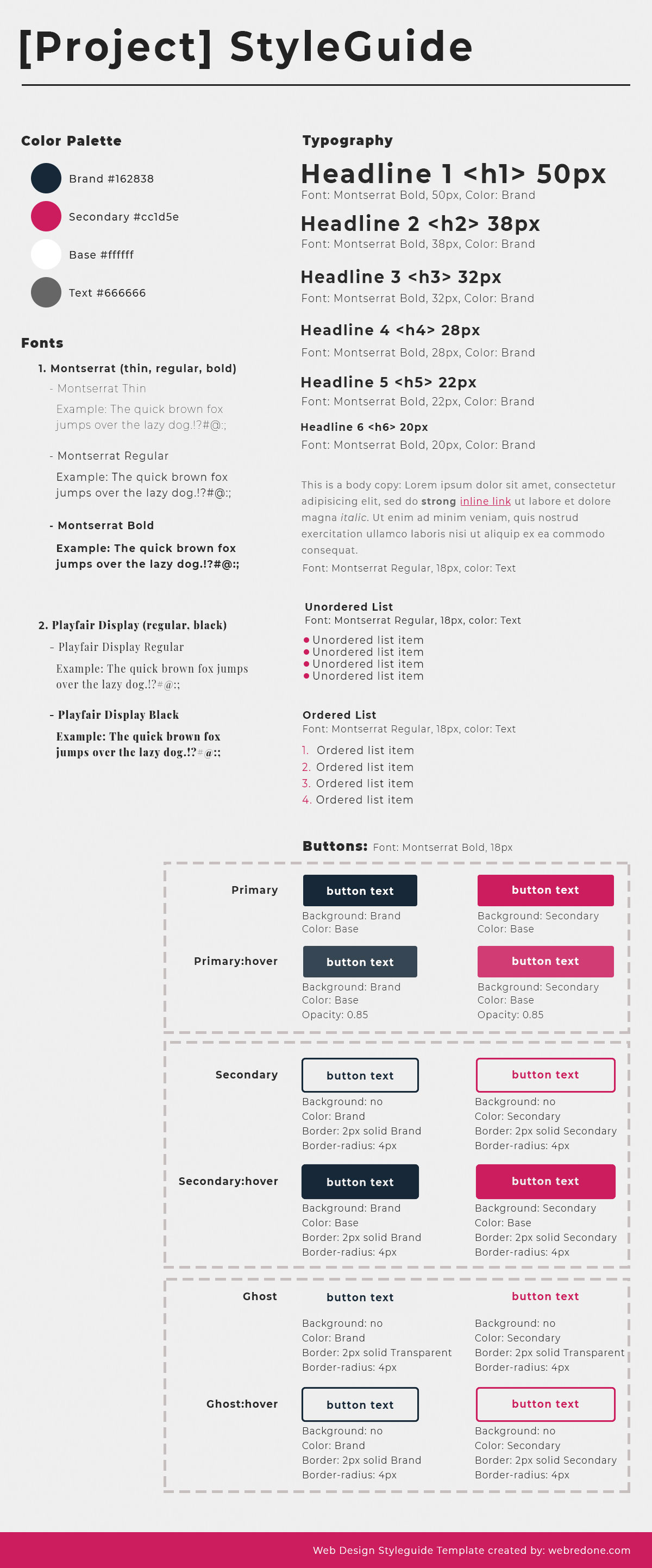
Feel free to download an example of a style guide that we created (the image above), for your reference.
PDF: web-style-guide.pdf
PSD: web-style-guide-template-download.psd
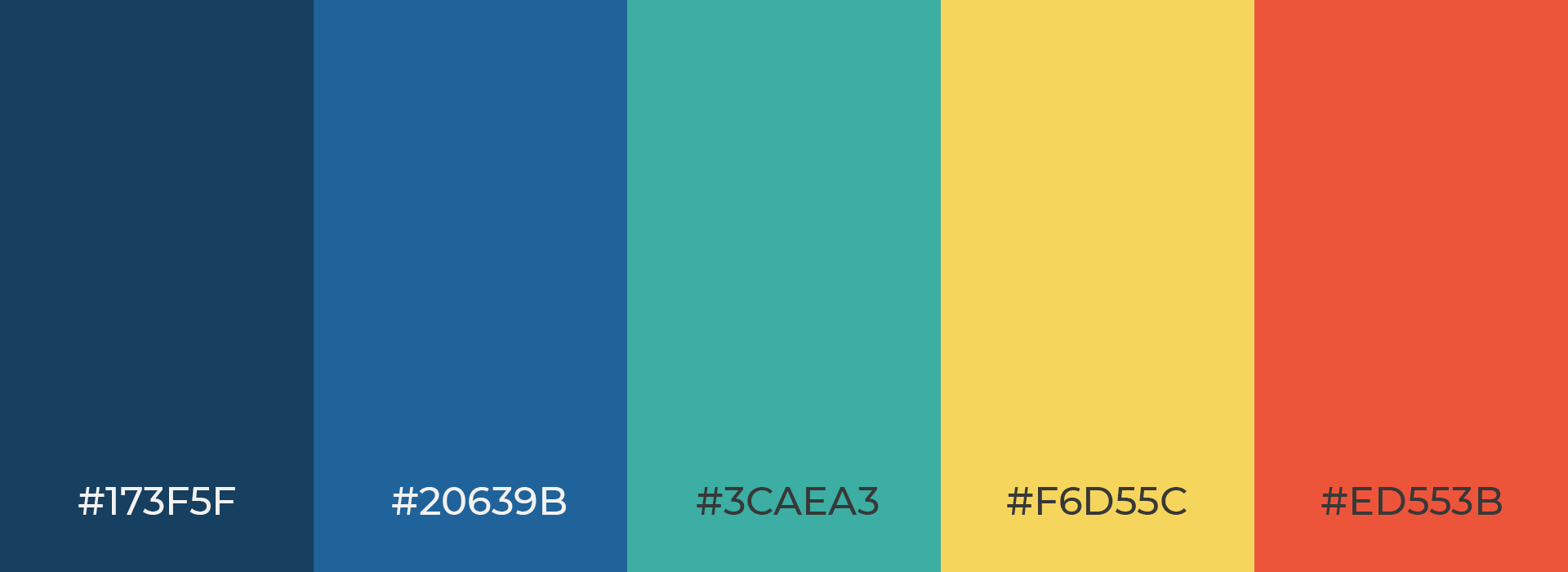
Color Palette
Define a palette of colors that you will use throughout the website.
Depending on whether the color palette is monochromatic, adjacent colors, triad, define colors and stick to them when you start designing. There should not be too many variations. If you use a certain shade of gray for a border of some elements stick to that shade, don’t slightly modify it for a border on another element.
Fonts
Focus on web-safe fonts that you can pick here: https://fonts.google.com/. For better website load time optimization try not to combine too many fonts or font-weights. 2 – 3 fonts with 2 – 4 weights are enough (400 for standard text, then 600, 700 and 800 or 900).
Headings (Titles)
In HTML there are 6 headings: h1, h2, h3, h4, h5, h6.
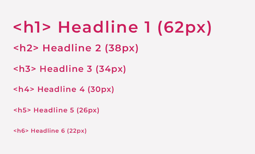
H1 should only appear once per page (usually at the top of a page in hero – section with a background image below the header with navigation, at least in standard layouts)
Define font-sizes and wont-weights (how bold or thin letters are) only for these 6 headlines (You may use variations tho; For example on the homepage, hero h1 may be larger than h1 in inner pages and blog posts).
H6 should have either the same font size as <p> (paragraph) or a bit larger.
Standardize margin-bottom for headings and all text elements in general (for example headings can have a margin-bottom of 20px, while paragraphs and lists can have margin-bottom of 10px).
Also define a good line-height for all text elements for better readability (Good value for paragraphs is about 1.4 or 1.5 – again, that depends on what font you use, and what you want to achieve for example).
Lists and Paragraphs in Web Design
List elements (either ordered or unordered) and paragraphs should have the same font-size (there might be cases where there are lists variations that may be different based on the design, but in general they should be the same as paragraphs.
Paragraphs may also have variations (For example if it is used as a subtitle below the titles (for example below h2). You can make it, for example, have a larger font-size and font-weight to better match with the headline that is above.
Standard font-size for paragraphs and lists should be about 16 – 18px (But again based on the design and how things are positioned they might be larger).
Buttons in Web Design
Define a few variations of buttons and reuse them throughout the website. (Design them in Photoshop, not in Illustrator)
For example One with the main brand color as a background, one with the main brand color as a border and font color but with a transparent background. Then a few more depending on the needs of the website based on the same color palette defined previously.
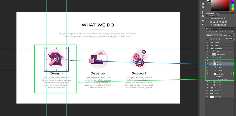
Photoshop (or any other tool) organization
Try to group as many things as possible and name them logically.
For example:
The header is one group that may also have sub-groups (for example navigation items).
A hero is also a group that has a background image, overlay (for better contrast), and text for example.
Stack groups logically as they appear in the design. (Header first, then below it hero, then section 1, and so on).
When you are working with sections try to standardize top/bottom padding (White space between the end/border of a section and contents of it) and margin (White space between 2 sections). If sections have standardized padding and the design allows it, there is no need for margins.
Use a starting width of 1920px for a .psd document but also use a 12 column grid to better align everything on the page. The grid should be somewhere about 1100 – 1300px wide, so the content can easily fit into laptop screens that are usually 1366px wide. (Disclaimer: You don’t have to use “containers” for everything, some sections may span the full 1920px width, but a large portion of the content should fit into a container (again, don’t strictly follow this).
You can download one of the grids here: https://hackerthemes.com/bootstrap-4-grid-psd/
When designing, try to do as much as possible in Photoshop and only use AI to design SVG graphics. Buttons, images should be defined in Photoshop – so that it’s easier for a developer to measure things, get colors, and in general have a faster workflow.
Also, that allows easier and better integration with 3rd party hand-off tools such as Avocode and Zeplin. Those tools generate CSS out of Photoshop pretty accurately and make it easier for a developer to just copy/paste styles instead of measuring things manually in the Photoshop file.
SVG elements: graphics, icons can, of course, be just imported from Adobe Illustrator.
Don’t use blending modes; Instead, achieve what you want by stacking layers on top of each other.
Responsiveness
When designing, keep in mind that 1920px (which we use as a starting width for the layout) is not fixed. There a lot of different monitor sizes, then there are tablets, cell phones, and so on. Try to imagine and then design so that it is easy for a developer to adapt for tablets and cellphones.
Learn the terminology and standard UI elements that are used in website design
For example Accordions, sliders, carousels, tabs, modals, forms (input fields, text areas, checkboxes, radio buttons, toggles) are all web design elements.
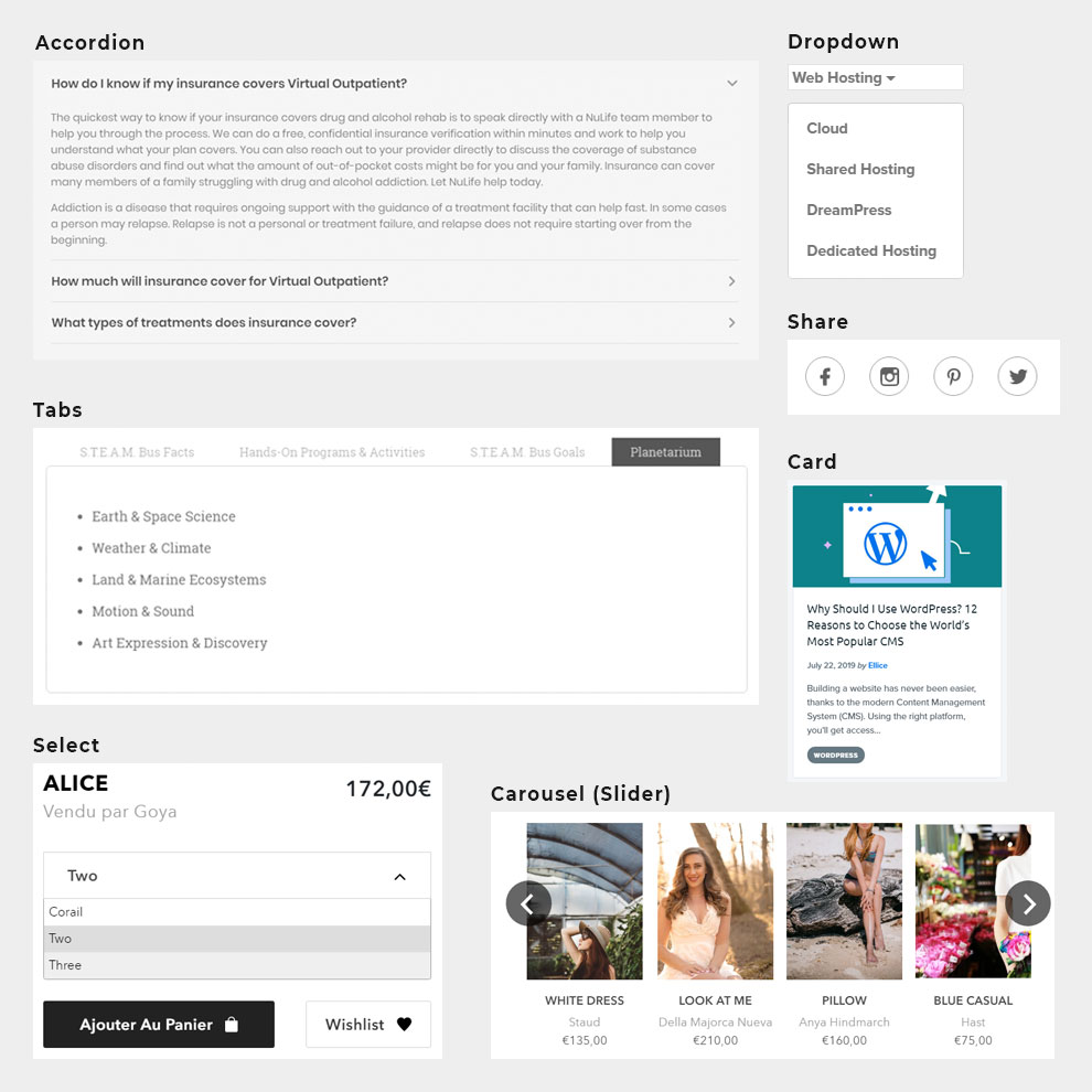
There are a lot of sources where this can be learned but here are a few good ones that showcase commonly used website design elements:
- https://material-ui.com/demos/app-bar/
- https://bulma.io/documentation/components/
- https://foundation.zurb.com/building-blocks/index.html
- https://www.usability.gov/how-to-and-tools/methods/user-interface-elements.html
- https://www.pinterest.com/bex_reynolds/web-ui-elements/?lp=true
- http://styleguides.io/examples.html
Interaction states
These refer to the mouse actions (hover, click), or if you check or select something among other things.
2 most common states are:
- :hover – when we hover over links, we should add a nice hover effect to indicate it is a link or that something will happen if we click.
- .active – State applied when something is “active”. Active tab item, selected option, open accordion panel.
What is a Good Website Design?
Website design, just as any design in general, is usually a matter of subjective preference, but there are still web design principles that when followed in the website design process can “make or break” a website.
Follow these web design principles to create great websites:
- Simple, easily understood, design with the right visual properly placed to grab user attention and emphasis on what matters most.
- Focus on white-space as much as you focus on the actual visual elements. Content needs space “to breathe”, and be easily spotted, and in general, it makes a website more effective.
- Fewer distractions (like banners or ads). Focus on what matters to the aimed audience and what they are on the website for.
- Visual cues and design elements that inspire users to go deep and research the website.
- Consistent use of design elements, color palette, and fonts across various pages of the website. (Don’t design 5 different versions of tabs for example).
- Navigation should be easily understood and intuitive.
- Make sure you have a balanced and tested color palette and keep in mind that there are visually impaired people. Good web design is all about everyone having the same user experience. Emphasize the contrast between text and background colors for example.
- Your website should be responsive (In the first quarter of 2019, mobile devices (excluding tablets) generated 48.71 percent of global website traffic).
- Animation helps users better understand what is happening or what is about to happen. It also makes the website feel more “alive”. Make sure to design subtle visual cues (What happens when someone hovers a link, clicks and when something is loading).
If you need help setting up a new website, or want to do a redesign of your old website with mobile responsive optimization, feel free to reach out, and we will be more than happy to help.